Color Theory
Color theory is a foundational principle in art
COLOR
Avinash
10/25/20252 min read
Color theory is a way to understand how colors work together in art, design, and everyday life. It helps us choose colors that look good and feel right.
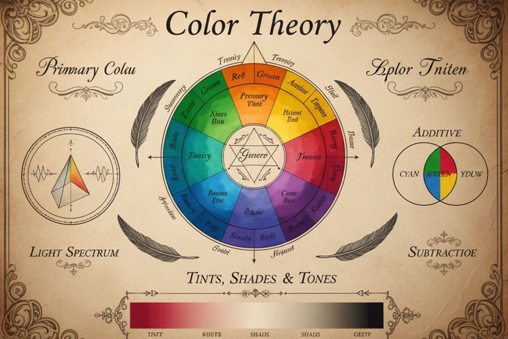
The Color Wheel
Think of the color wheel as a circle made up of colors. At its base are:
Primary colors: Red, yellow, and blue; these colors can't be made by mixing others.
Secondary colors: Green, orange, and purple; these happen when you mix two primary colors.
Tertiary colors: Colors like yellow-orange or blue-green, made by mixing a primary with a nearby secondary color.
Color Harmony
Colors can look nice when they match or contrast well. Here are some common ways to pair colors:
Complementary colors: Colors opposite each other on the wheel (like blue and orange), which create strong contrast.
Analogous colors: Colors next to each other on the wheel (like blue, blue-green, and green), which blend smoothly.
Triadic colors: Three colors evenly spaced around the wheel (like red, yellow, and blue), which create lively but balanced designs.
Understanding Colors
There are three main parts of color:
Hue: The actual color you see, like red or blue.
Saturation: How bright or dull the color is.
Value: How light or dark the color looks, which you can change by adding white, black, or gray.
Warm and Cool Colors
Colors also have "temperatures":
Warm colors like red, orange, and yellow feel energetic and cozy.
Cool colors like blue, green, and purple feel calm and cool.
Simple Examples to Use
Look at a color wheel showing all the main colors and how they connect.
Try a complementary color scheme by pairing a blue background with orange objects for a bold look.
Use an analogous color scheme with blue, green, and teal for a peaceful feel.
Pick a triadic color scheme like red, yellow, and blue for a bright and balanced design.
Compare warm vs cool colors to see how they change the mood of a space or picture.
Using color theory basics like these helps make your design or artwork look more appealing and express the right mood easily. Simple knowledge of the color wheel and color harmony can make a big difference in how your colors work together.